
Encrypted Connectivity. Redefined.
Branding for a Satellite ISP & VPN Leader.
StratoSync® needed a visual identity that could mirror their core mission: seamless, encrypted, and high-speed global connectivity. The challenge was to craft a brand that not only stood out in the crowded satellite ISP and VPN market but also built immediate trust and credibility. By focusing on sleek, high-tech aesthetics and strategic branding, the goal was to transform StratoSync® into a leader in encrypted satellite networking.
DESIGNING:
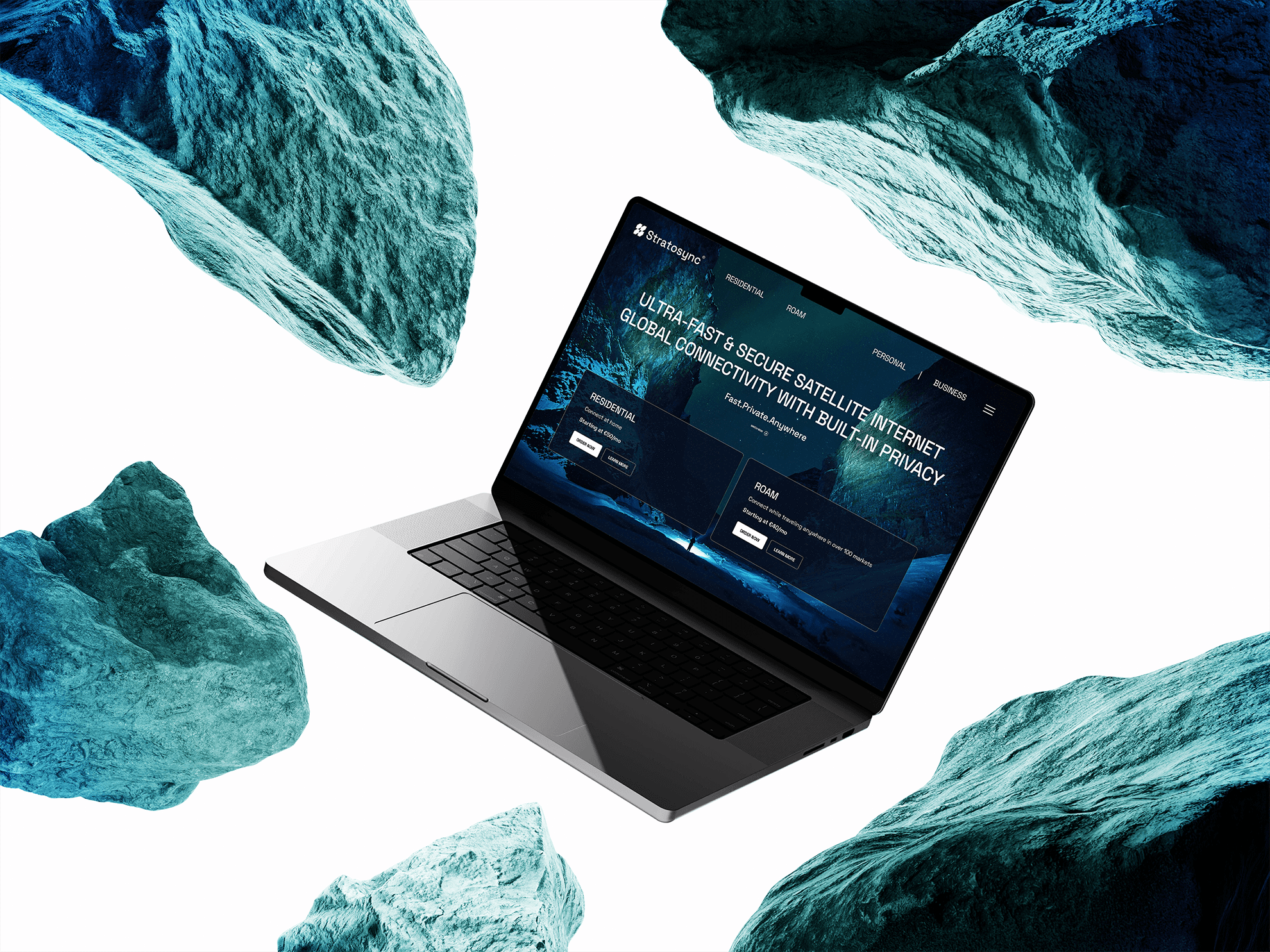
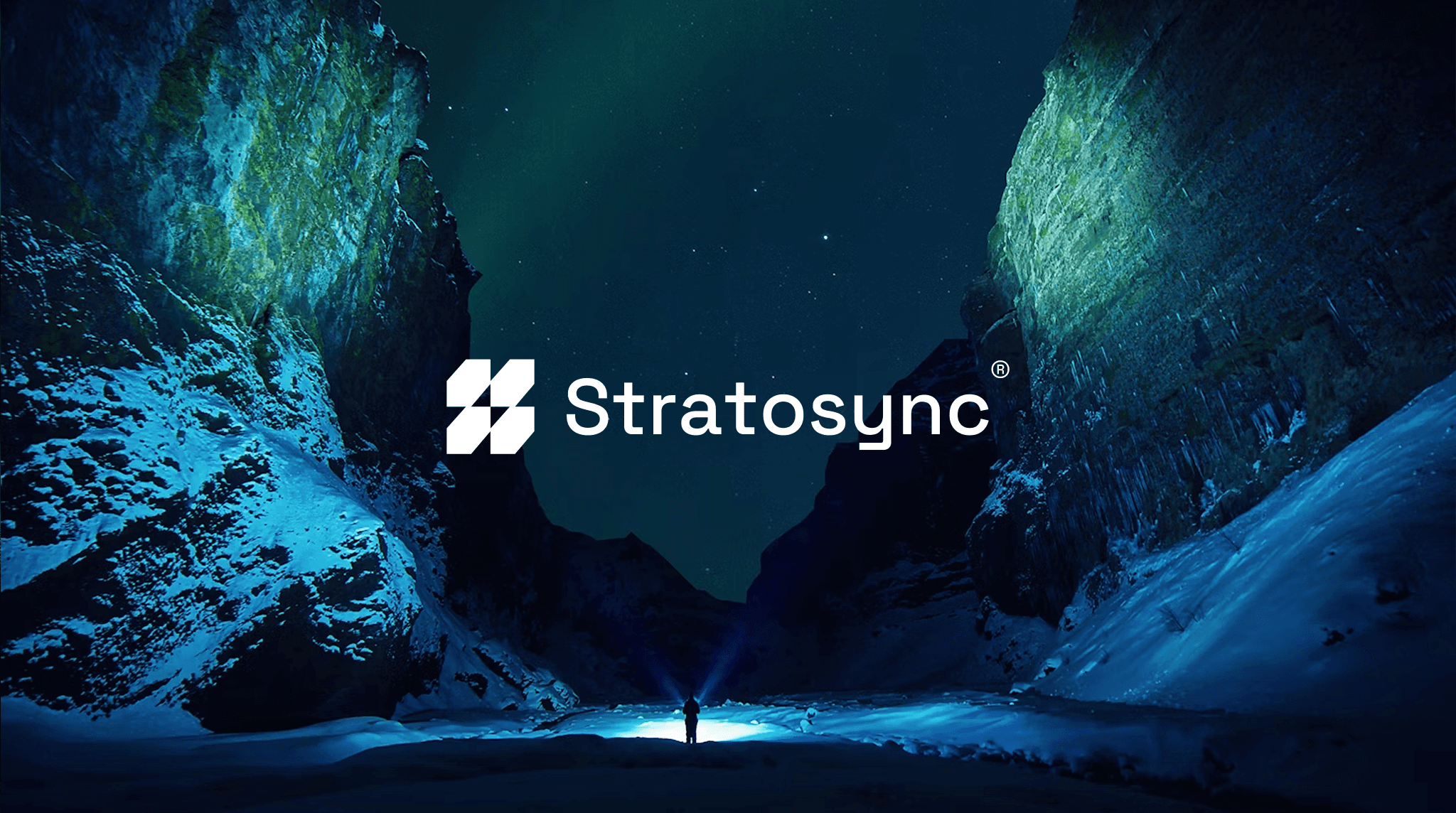
The StratoSync® logo combines synchronized data flow, satellite pathways, and geometric precision - a symbol of speed, security, and innovation. A deep space blue and neon cyan palette enhances the brand's technological edge, while bold, futuristic typography reinforces clarity and authority.
In a market flooded with generic cybersecurity brands, StratoSync® needed to command attention. The new visual identity was designed to do just that - creating an authoritative presence that built trust instantly. The impact was immediate: brand recognition increased by 52%, website conversions rose by 41%, and VPN engagement grew by 29%. The result was a brand that doesn’t just look good but performs.
DEVELOPMENT:
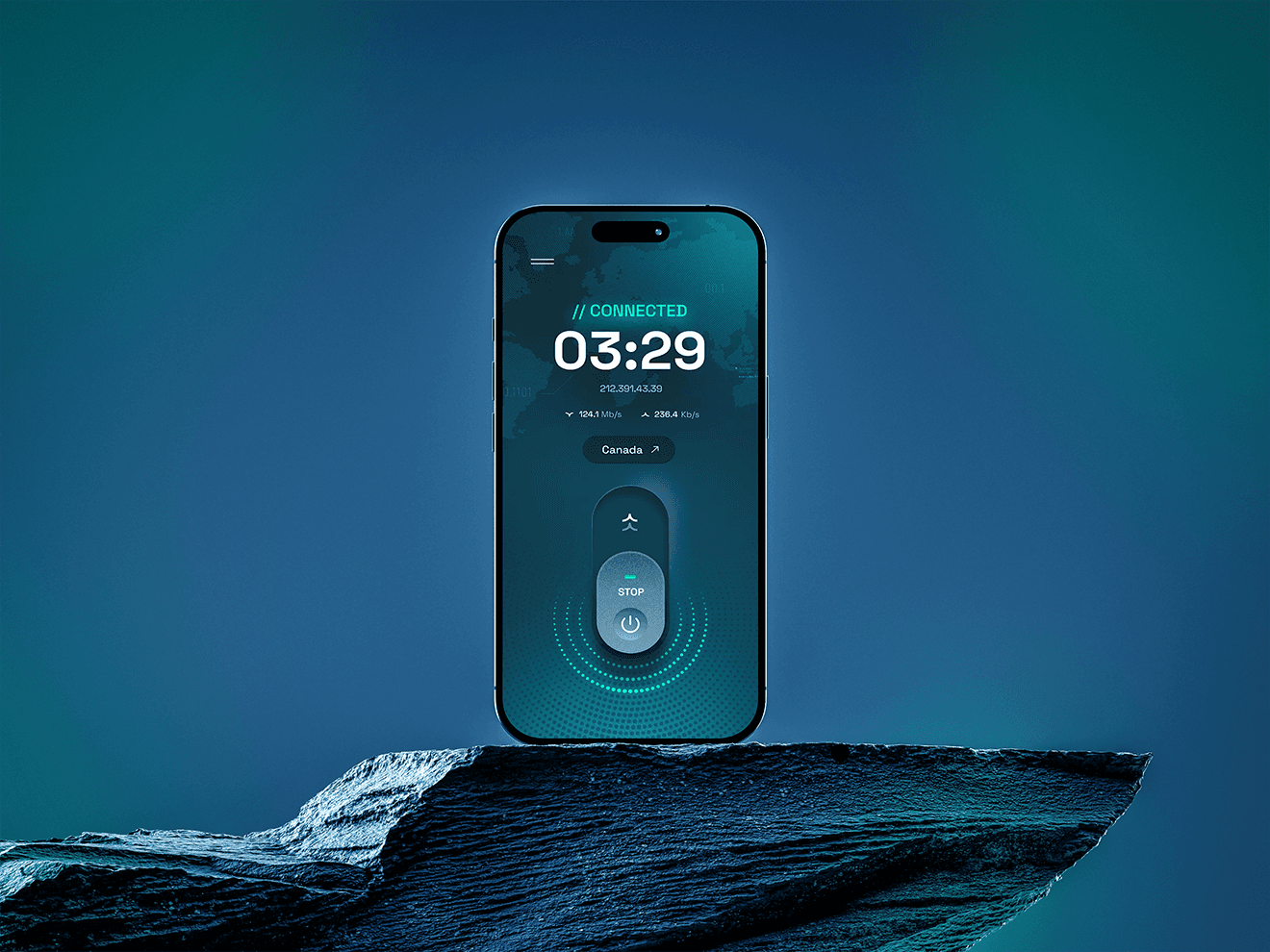
The branding scales effortlessly across platforms with a dark-mode UI, glowing accents, and smooth animations for a sleek, high-tech experience. The VPN app features an intuitive design, an encrypted world map, and high-contrast CTAs that enhance engagement and clarity.